Radio group
A section block with a radio group in an app card builder kit allows you to group related radio buttons in a section. This component lets you select one option from a list. A radio button represents each option. It enhances the user interface by organizing choices clearly within a structured layout.
Example
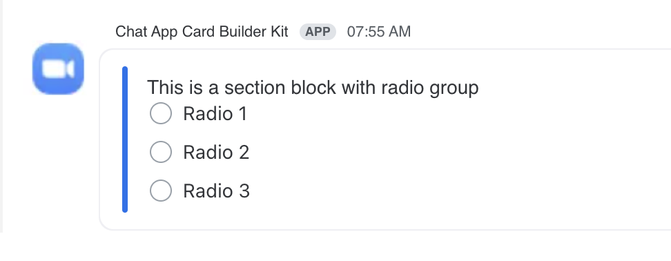
JSON example
{
    "content": {
        "settings": {},
        "body": [
            {
                "type": "section",
                "layout": "horizontal",
                "sections": [
                    {
                        "type": "message",
                        "text": "This is a section block with radio group"
                    },
                    {
                        "type": "radio_buttons",
                        "action_id": "radio_action",
                        "options": [
                            {
                                "text": "Radio 1",
                                "value": "value1"
                            },
                            {
                                "text": "Radio 2",
                                "value": "value2"
                            },
                            {
                                "text": "Radio 3",
                                "value": "value3"
                            }
                        ]
                    }
                ]
            }
        ]
    }
}