Zoom Chat App Card Builder
The Zoom Chat App Card Builder provides code blocks and templates you can use to quickly create app cards for Zoom Chat.
User interface controls
Figure 1 shows the App Card Builder user interface. You can see the controls available highlighted in red.
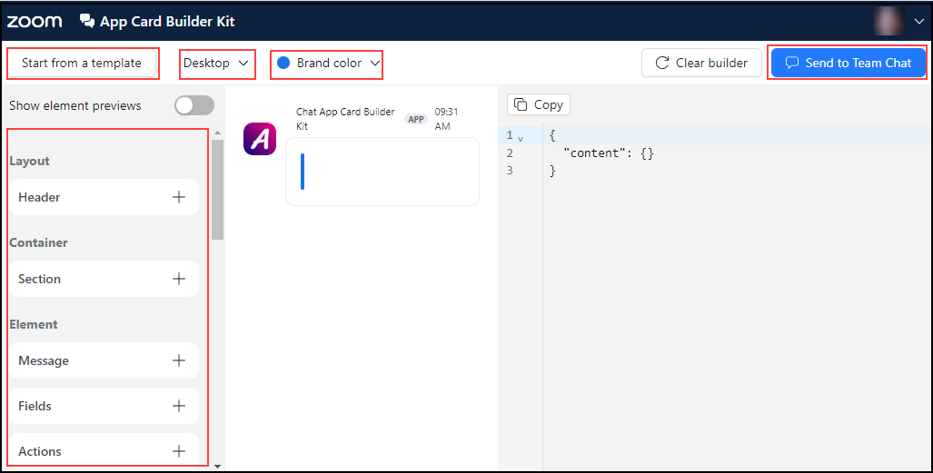
Figure 1: App Card Builder user interface
| Control | Description |
|---|---|
| Start from a template | Offers two templates: common and form. |
| Desktop/Mobile | Provides the best display for either desktop or mobile. |
| Brand color | Adds a default sidebar color. |
| Send to Zoom Chat | Sends an app card to a Zoom Chat. |
Code blocks
You can drag and drop the available code blocks on the preview area or use one of the templates to create the code structure for your app.
Figure 2 shows the App Card Builder user interface with the grab hand cursor. You can see the code display on the right side of the screen.
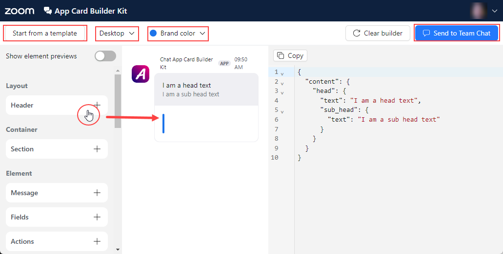
Figure 2: App Card Builder with grab hand cursor
This table describes the major elements of the App Card Builder user interface.
| Element | Description |
|---|---|
| Header | Adds header or sub-header text. |
| Sections | Adds the following code blocks: - Message - Fields - Static Select - Member Select - Channel Select - Button - Overflow Menu - Image - Date Picker - Time Picker - Radio Group - Checkbox Group - Switch Group - Footer |
| Actions | Adds the following code blocks: - Basic Buttons - Feedback Buttons - App Modal |
| Elements | Adds the following code blocks: - Message - Fields - Attachment - File Card - Divider - Progress Bar - Static Select - Member Select - Channel Select - Time Picker - Date Picker - Radio Group - Checkbox Group - Switch Group - Alert - Multiple Image - Plain Text Input - Multi-line Text Input - Video |
| Markdown | Markdown blocks must be placed within a message block. - Bold - Italic - Strikethrough - Monospace - Color - Blockquote - Link - Chat Link - Mention - Profile - Image - Date Time |
| Rich Text | Rich text blocks must be placed within a message block. - Bold - Italic - Color - Link - Editable |